
Minimalism seems to be an everlasting trend that just doesn’t seem to stop. And I’m getting fed up by its dullness, impracticality and lack of personality. Apple has been a well known trendsetter for minimalism, followed by every other industry, ranging from furnitures, home appliances to cars. Minimalism was supposed to get rid off all the unnecessary extra clutter, but does it come with the cost of practicality? Does it make the user experience worse when the product isn’t self-explanatory to use? Oh boy, it truly does.
Electric vehicles
Let’s start with the positives:
First of all, I do think EVs are the future and I even bought one! Thanks goes to Tesla for disrupting the car industry and making EVs mainstream, it was about time! I however didn’t get a Tesla, more on that later…
It makes more sense to drive with electricity that you can even produce yourself with solar panels than to rely on a unreliable supply chain of oil. Oil is mostly produced in geopolitically unstable countries where wars are frequently fought. Not only does buying oil support countries with poor human rights and even dictatorships, but on top of that we get smoggy, smelly and noisy cities & motorways. So yes, for me it’s an absolutely no-brainer to get an EV.
They are expensive, yes. But the used car market is growing fast and competition drives prices down. Infrastructure in Finland at least is also excellent already. Also the battery technology can only improve and the whole counter-argument for cobolt dependent batteries gets old fast. Cobolt is problematic because it’s mined mostly in Congo in terrible working conditions. In the bright side, we already got LFP – batteries that don’t include any cobolt and we are only getting better and better batteries, thanks mostly to Chinas efforts. I also believe that manufacturing will improve and get greener as the technology matures 🙂
Then the negatives:
When Tesla made EVs mainstream, they introduced a completely new car cabin. The cabin was stripped out of excessive buttons which you may have seen in legacy cars, and the centre console was dominated by a large touch screen.
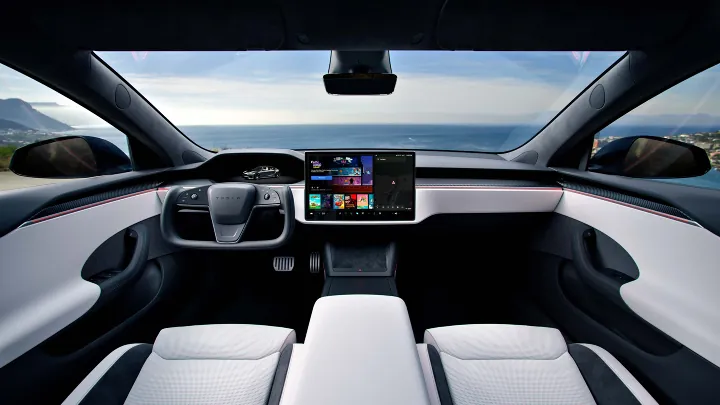
It immediately becomes clear everything is software driven. Even ridiculous things like opening a glove box. In Teslas defence, they most likely didn’t make the decision to make the car as minimalistic as possible only based by aestethic reasons but just because it’s the most cost efficient way of producing a car. Don’t get fooled this is a fashionable choice, it’s cost driven. Minimalistic styling is a convenient way to mask the obvious usability flaws. You don’t need to install as much as wiring throughout the car if you rely mostly on centralized software based solutions. Tesla has been very good in cost efficiency and that’s one of the reasons they’ve been so succesful. Other manufacturers jumped into the bandwagon by copying the worst things of Tesla and neglecting on the part of how to make a proper EV.
My list of the most stupid things in EVs:
1. Over reliance on the main touch screen
OK, car manufacturers used to have way too many physical buttons in the center console. There were plenty of buttons I never even pushed in my previous car. But is it really smart to get rid of every physical input and stuff them into a really busy and complex touch screen user interface? This causes lots of distractions for the driver. Thankfully we are witnessing the return of the button and manufactures starting to realize they should find the correct balance between physical controls and UI controls.
I bet if you put two car drivers, one relying on a legacy car with lots of buttons against the other who relies on a single touch screen, to compete together on how to accomplish simple tasks such as controlling door windows, air vents, cruise control, AC controls, glove box – the guy with the legacy car would win in speed.
2. Flush door handles
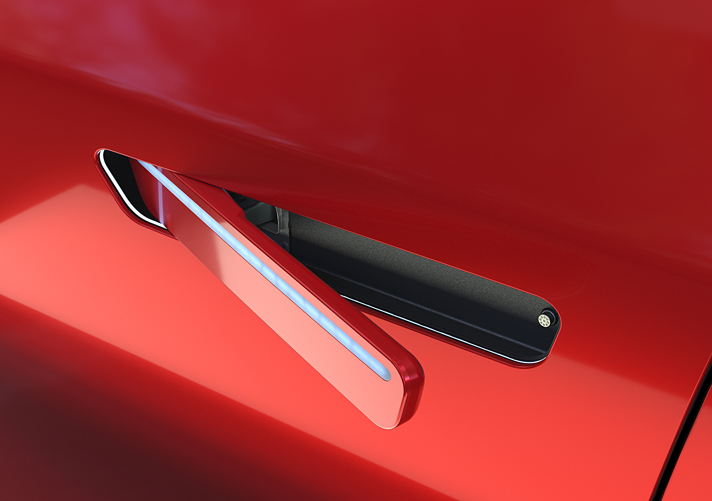
Solving a problem that never was a problem just to gain some miniscule increase in range. There has been plenty of reported issues of door handles freezing during winter. Also people have died inside a car during a crash when they couldn’t get out and the rescuers couldn’t open the doors. Some models may include a mechanical release, but that is hidden because it may ruin the “feng shui” of the car. Theres a good reason why China decided to ban these idiotic car doors.
3. Software controlled air vents
Why? Such an easy mechanical solution already existed but you had to bring software in to the game and make the driver fiddle in UI menus *while driving* just to accomplish a trivial task? A task you suddenly cannot do without taking your eyes off the road.
4. Wheel controls & wheel shape
Volkswagen did some ridiculous mistakes in their early EV models, they decided to make the buttons in the drivers wheel touch sensitive. So when you drive you could easily trigger some button by accident. Why did they do this? It looks modern and clean. Screw the users daily driving it! They’ve learned from their mistakes and thankfully are bringing physical buttons back.
Then theres the shape, this goes into the same category as a door handle. Something that has worked well for decades and nobody complained about, suddenly becomes something you need to reinvent. Tesla was the first EV manufacturer to introduce the “yoke”, which doesn’t seem to have caught on. It isn’t a new invention though, this same mistake has been done before in history. Toyota being the latest to repeat the mistake…
Teslas blinker controls are terrible. Blinker stalk is still unbeatable in practicality.
5. Gear selector
There are tons of different gear selector designs in EVs. Why? Disruption for the sake of disruption, thats why 😉 The old fashioned huge gear selector familiar from automatic geared cars is admittedly a bit too bulky, but it was very intuitive and you learn to use it right away. Teslas gear selection happens on the main touch screen, which looks a bit uncomfortable to use. It however is apparently smart so you don’t need to swipe it that much. Hyundai has introduced crazy crystal ball designs, which looks absolutely unnecessarily complicated just to do a simple thing. Granted, looks pretty cool, but I can live without it!

6. EV has to look like an EV. Does it really?
For some reason, some legacy car manufacturers have gone all the way to create a distinct design for their EVs. For some reason the car needs to scream “I’m an EV!!” rather than just being a next step in evolution. Some car manufacturers have done this well and tastefully, Teslas design is a bit plain but somewhat classical (excluding Cybertruck, yuk).
I also think KIA has done awesome job in rebranding and creating a consistent and unique design language for their EV lineup. But others, such as Mercedes-Benz and Volkswagen were way too “soap barry” blobs in their earlier designs, which probably is good for aerodynamics, but I personally don’t find them appealing.
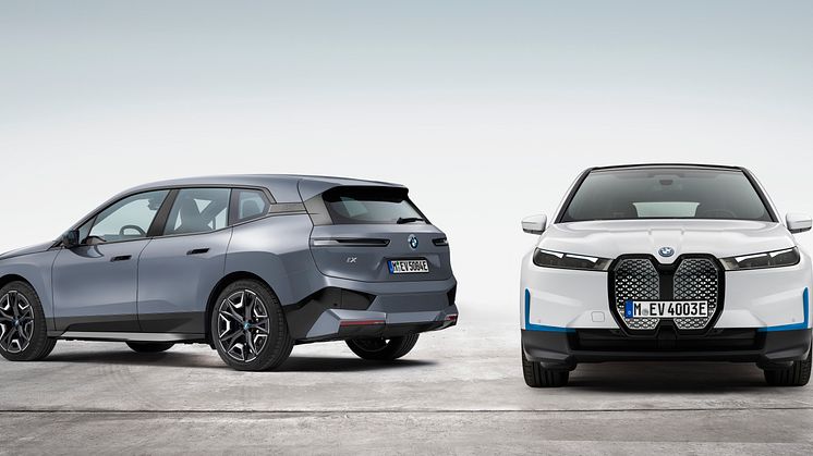
But the worst of the worst must be BMW, oh how they butchered their designs. All they had to do is to keep their distinct, cool designs and just change the drive train to electric. But no, they really went into a completely unnecessary identity crisis. It’s sad, even though I’ve never cared for BMW. Let’s not even get to Ferrari Luce and Jaguar in this post…
7. Car applications
Software is something where Tesla is excellent, and other manufacturers are lagging behind. My EV’s mobile application is terrible to use. You may need to sign in multiple days during the same day, the remote commands can take minutes to go through. It drives me a bit crazy sometimes. During my trip in Norway, the car claimed the car doors were unlocked in the city. Well, I went all the way to check and lo and behold, they were locked all the time. Kind of important information to be accurate, right? The car itself is great, but the mobile application is terrible.
8. ADAS, aka “nanny systems”
New advanced driver-assistance systems are not specificly for just EVs, but all new cars in general. And many of them are not manufacturers ideas, but are driven by regulation. ADAS systems are meant to make driving more safe, and they probably (maybe) achieve this. There are also genuinely useful ADAS systems that improve the user experience. But then there are the ones that can be extremely annoying. I call these nanny systems.
The level of annoyance by these nanny systems differ a lot between manufacturers, some implement them with usability and daily experiences in mind, some over emphazise them and have a “in your face” – approach with lots of excessive beeping. The most common ones that regulation demands to always turn on automatically when you start the car is the speed limit and the driver monitoring system. These are the ones you most likely encounter in your daily driving. There are of course lots of other systems too, all of these stack up and can make driving frustrating, especially if there’s not an easy way to disable them. Here’s an example of how frustrating they can be (I obviously do not recommend taking the ADAS fuses off) 😀
I’m able to add a shortcut to mute the speed limit warning, and the beeps are not that bad in my EV. But the driver monitoring system for fatigue and eye tracking can get a bit overly sensitive when you’ve been driving around 300km straight. This seems to be a treshold where my car requires me to take a break.
9. EV Charging – the appocalypse
This isn’t about the EV’s themselves but the infrastructure. Every EV charging operator have their own mobile app you had to download to charge your EV and it has been a complete hell. Every time you faced a new charging operator, you needed to create an account, give your names, email, tell them where your birth marks are, credit card number, set up passwords and so on.
Luckily, regulation has forced the operators to accept card payments, which makes life a little bit easier. But it’s just ridiculous how EV charging was solved in the beginning: everyone trying to build their own walled garden. A good benchmark on how to do it, would be to just copy what petrol stations have done for ages. You come in, pay with card, no apps, no nothing. So easy, what on earth were they thinking the added value or benefit would be to the customer? There’s none for the customer, they’ve all just wanted to gather a huge userbase and somehow become the king of EV infrastructure, problem is when everyone thinks the same we get hundreds of mobile applications and everyone suffers.
They really messed this up, horrible.
Rushed and half-baked
The picture becomes clear when you observe these items. In all of them, legacy car makers have rushed to reinvent everything, when they could’ve just focused on the most meaningful parts that makes not only a good EV but a good car. First models were half-baked, but luckily there’s atleast some signs of reviving practicality in newer cars.
What EV did I get?
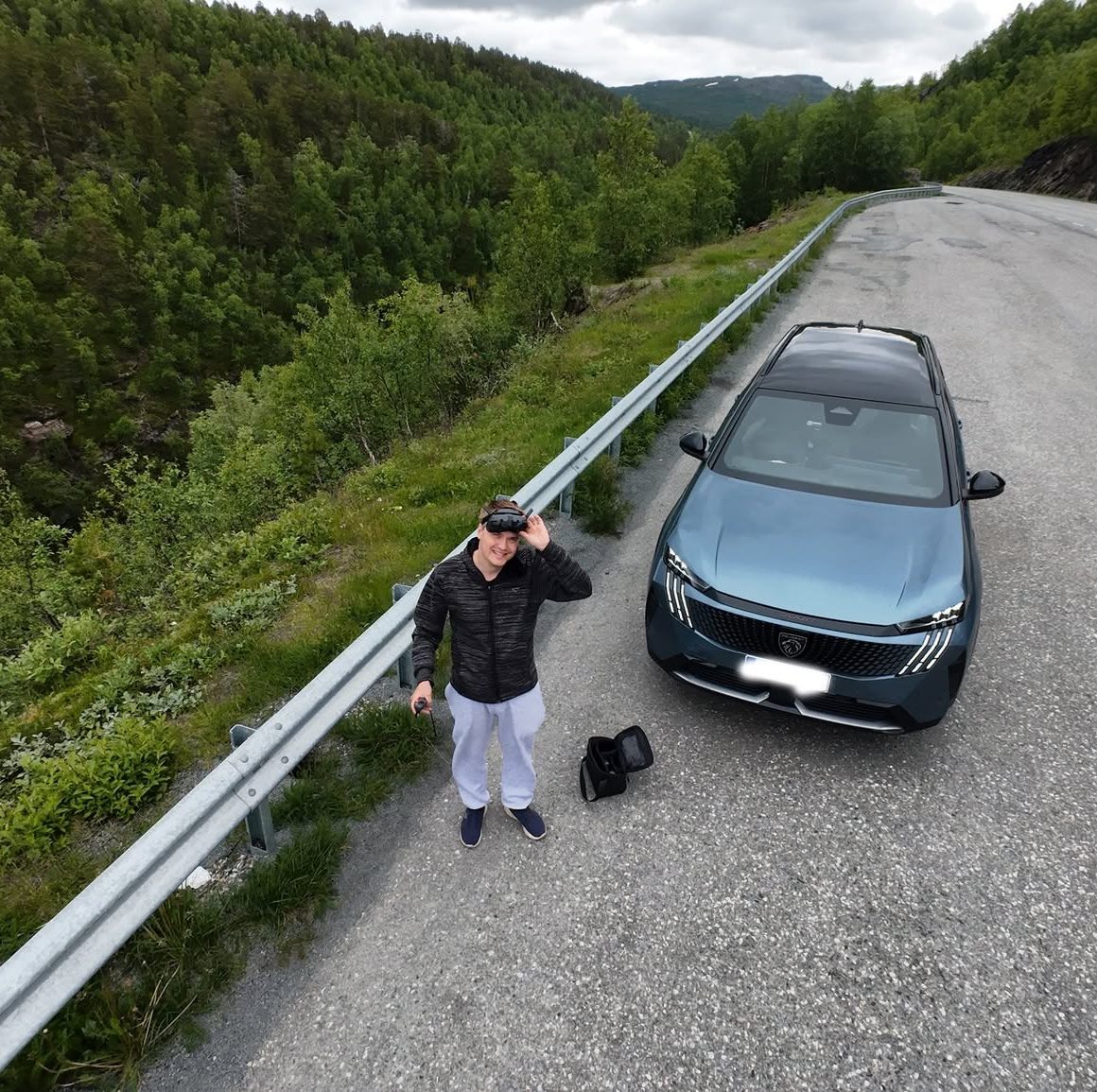
Because of above stupid design decisions I’ve listed in this post and also practical reasons, I ended up getting a Peugeot E-5008. Peugeot has a terrible rep in Finland, but it’s not a first time I’ve been told a car brand is terrible but I bought it anyway and thought it was great! People tend to have deep prejudices when it comes to cars.
This is a great family car, took my family (2 adults, toddler and golden retriever) all the way to Lofoten, Northern Norway this summer! Has been reliable, has a good balance with physical and touch screen controls. Has proper mechanical door handles, really effortless and comfortable to drive and even has good usability. Inbuilt UI may not be intuitive for some people, I’ve however found it very easy and think the iToggles are pretty neat! I also think it looks cool, but this divides people 😀